Home › How it looks
Make it look the way you want
Four skins, a full dark mode, and a bottom bar you can cut down to the icons you actually use. None of it changes what the app does — it changes how quickly you can read your shift schedule at four in the morning.
There are also sun and moon icons in the bottom right corner of the app, which switch between the two without opening Settings at all.
Dark mode is properly dark
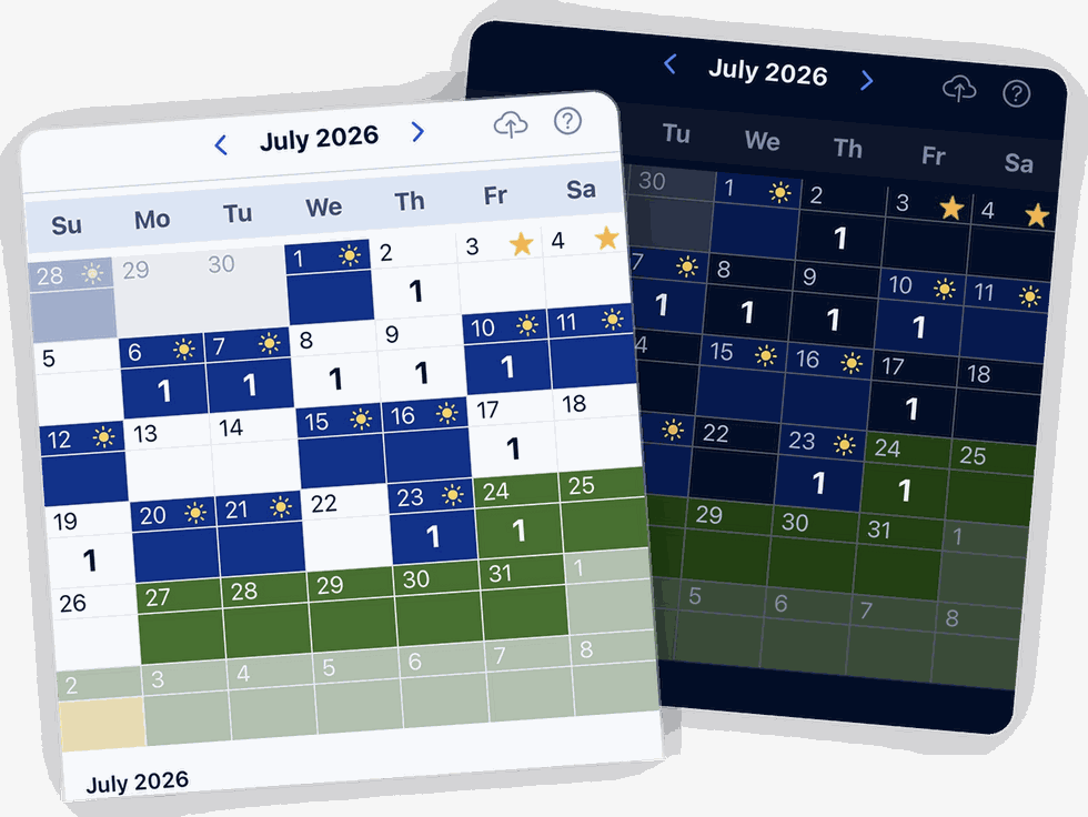
It turns the whole calendar dark rather than inverting the text and leaving a white grid behind. If you check your schedule in a dark bedroom, or in a car at three in the morning, that is the difference between glancing at your phone and being blinded by it.
Every skin works in it, and your colour coding survives the switch: blue is still a scheduled shift, green is still leave.
Four skins
Two of them decide whether the day cells are squared off or rounded. The other pair decides what sits on top of each cell — the date, or the number of events that day. Pick whichever you read faster.
The Modern skins are worth trying if you use the calendar mainly to see how busy a day is rather than to find a date. The count sits where your eye lands first.
BlueShifts. Plan Your Year. Own Your Time.
The shift calendar built for your rotation, off-duty work, and life on and off the clock.
Pick a skin, save your rotation, and stop thinking about it.
Holidays are marked with a star
The federal holidays are already in the app. You do not type them in, and you do not go looking for them — they are on the calendar from the day you install it.
- A federal holiday. Built in, on every calendar.
- One you added yourself. The same star with a blue dot, so your agency's own days stand apart from the national ones at a glance.
The star does not take the day off your calendar. It sits where the sun, moon or clock would be, and if you are working that day the cell still shows as a working day. Plenty of officers work the holidays; the calendar says so.
Sunrise and sunset, when they matter
For an hour either side of sunrise, and an hour either side of sunset, the main calendar page shows you the sunrise or sunset time.
That is there for one reason. Lighting offences are written against sunset and sunrise, not against a clock time, and the times move every day of the year. An officer working traffic in that hour needs the time for today, in the place they are standing — not a rough idea of when it got dark.
Outside those windows it is not on the screen, because outside those windows it is not the question.
The rest of the Appearance settings
Twenty-four hour time is a switch, which is worth knowing about if your roster is posted that way and you would rather not translate it twice a day.
And the bottom bar is a set of checkboxes. Almost every icon can be switched off, so the bar ends up holding what you use and nothing else. The calendar and the settings icons are the two that stay — those cannot be turned off.
Appearance
Bottom Bar Icons
The shield and the document icons are the police-facing ones. Turning those off is part of how the app works for anyone on a rotation, not just officers.
Set it up once and stop thinking about it
Save your rotation, pick a skin, and the calendar looks after itself from there.
Scan to install